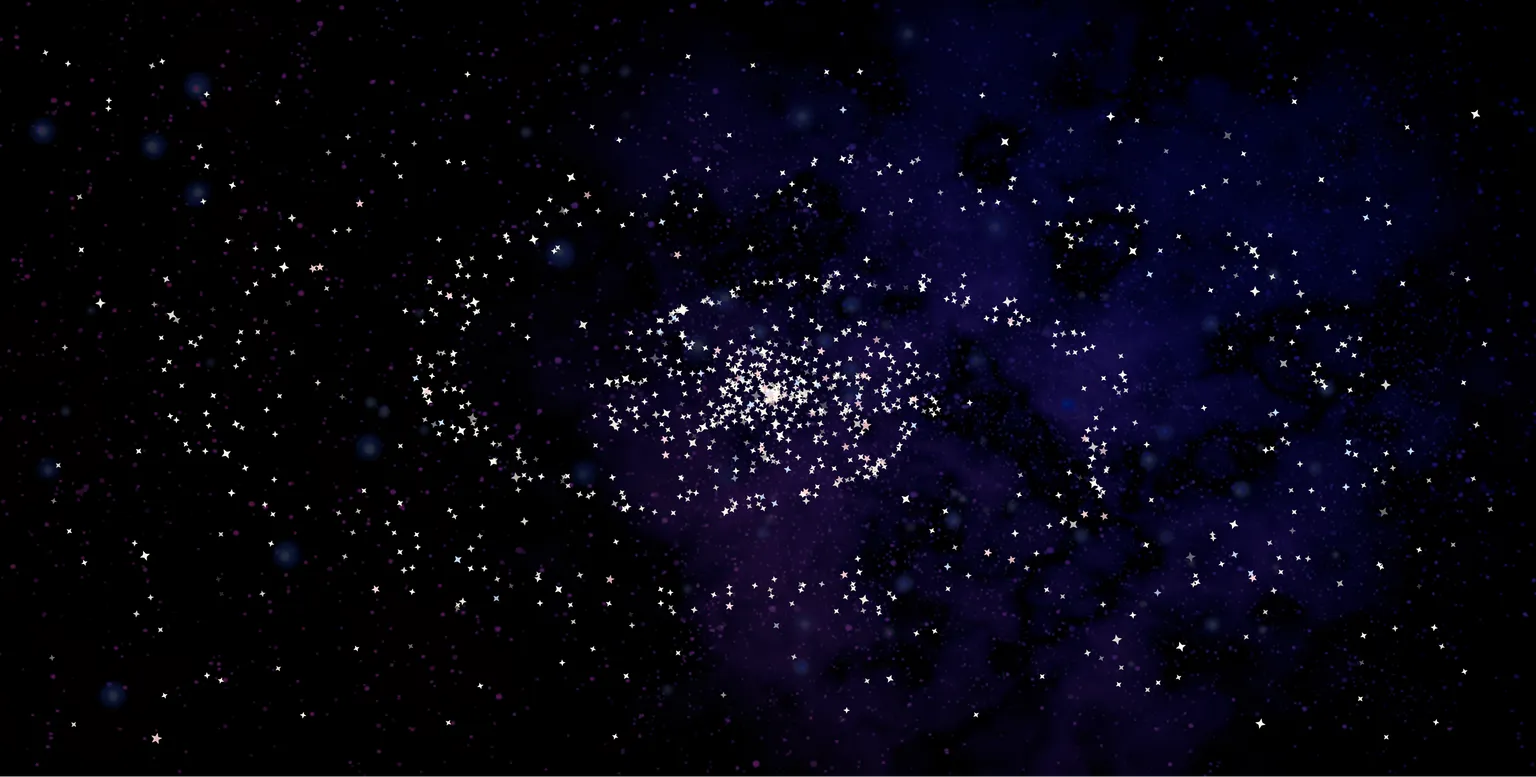
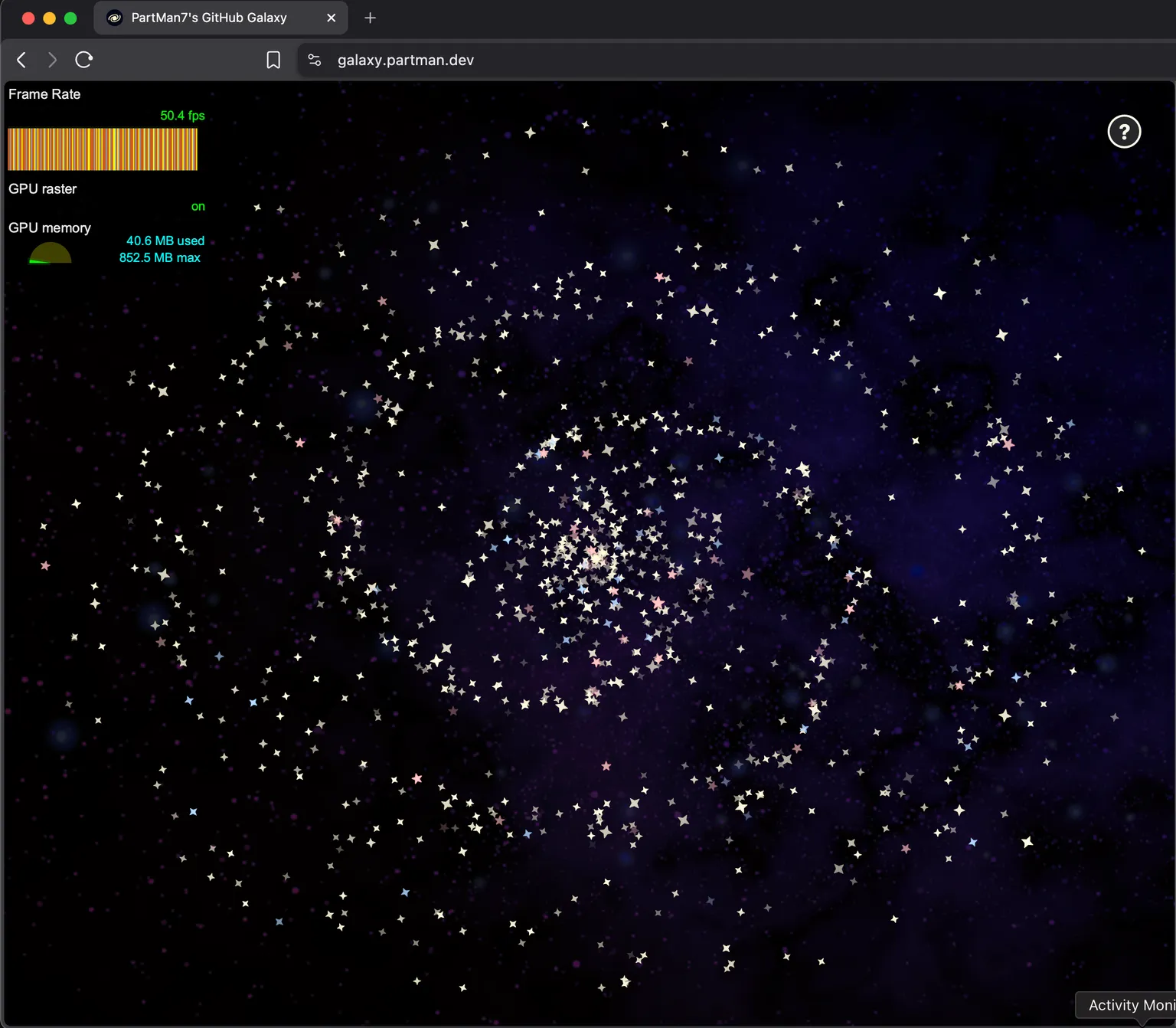
GitHub Galaxy
Have you ever stopped to consider that maybe you push too often because you test in production and rely on a robust keepalive system with cache invalidation? And because of this your GitHub profile sometimes has massive spikes of activity when you're trying to resolve a particularly frustrating issue, and that it's a lot of entries? And that maybe you should consider plotting this as a galaxy so you can admire your terrible code quality?
...just me? Well, okay then.
As someone who pushes a lot of code regularly, I thought it'd be fun to make a galaxy to visualize just how much it actually is. It's not really a good metric - after all, more code is worse code - but it's still a cute visualization and I'm pretty happy with how it turned out.
Armed with knowledge I'd picked up from a Josh W. Comeau course, I decided to give this a whirl. In my mind, it was a pretty simple idea - you take the entries that are shown in the GitHub activity graph, and just show them as stars. Maybe make 'em move or something.
Instead, we go into statistics, math, and some very weird CSS transforms.
# Part 1. The Data
Now, we first need to look at what data we plan on putting in the galaxy, and how we can get it. I was working towards a concept where I could look at every star and map it to something. Knowing this, I decided to use everything on GitHub with a relevant time-sensitive entry as a star.
For this, I use the GitHub GQL API to fetch the following for a given user with public activity over the past year:
- commits
- issues
- pull requests
For the cuteness factor :sparkles:, I decided to make each rendered star depend on the source info - so a bright star would be more recent, a bigger star would be more impactful, and so on. Each type also has its own color. Getting this info from the GQL API is pretty trivial, so I won't really elaborate much, but feel free to check out the source code for reference.
I cache this data on the backend for a day, and only recompute this after it expires. That way, we won't end up running repetitive calls of a pretty heavy query - after all, we fetch a lot of data in each run.
# Part 2. The Stars
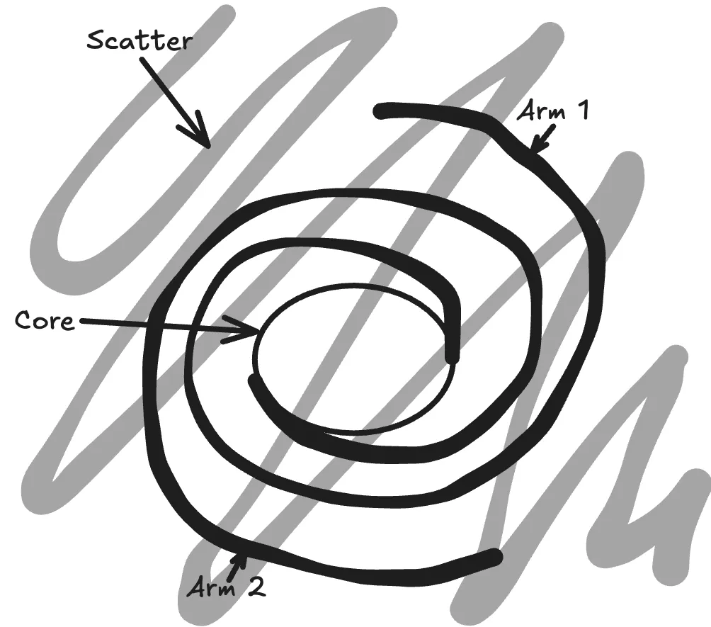
So in the 'traditional' mental picture we have of a galaxy, most of us straight-up think of the Milky Way, so I'll use that as a reference. We can break the stars into three groups - the 'core', the 'arms', and the 'scatter'. The core stars are the ones in the central cluster, and form a dense circle. These branch out into two arms that spiral around the core and grow less defined as they get farther from the center. Finally, the scattered stars are distributed uniformly around the screen.
With this out of the way, now we have a ton of stars with various stats like size, shape, brightness, and color. Next, we need to position these so they cluster together to form a galaxy, and then finally animate them.
To do this, we randomly assign each star to one of the groups. This is a weighted distribution (3:3:2 between center:arms:scatter). For now, let's place each star on a 500x500 square - we can scale this later to stretch depending on the screen size.
We define a lot of random, on-the-spot constants about how we want the shape of the galaxy to be.
export const CENTER_RADIUS = 60;
const ARM_INIT_THETA = Math.PI / 4;
const ARM_TURNS = Math.PI * 2;
export const ARM_RADIUS = 150;
const ARM_BASE_THICKNESS = 50;
const ARM_TIP_THICKNESS = 5;
const SCATTERED_DISTANCE = 250;
export const GALAXY_SIZE = 2 * SCATTERED_DISTANCE;
export const CENTER_RADIUS = 60;
const ARM_INIT_THETA = Math.PI / 4;
const ARM_TURNS = Math.PI * 2;
export const ARM_RADIUS = 150;
const ARM_BASE_THICKNESS = 50;
const ARM_TIP_THICKNESS = 5;
const SCATTERED_DISTANCE = 250;
export const GALAXY_SIZE = 2 * SCATTERED_DISTANCE;# The Core
The core is relatively easy to set up. In the scripts that are responsible for calculating the position of each star (affectionately called the plotter), stars assigned to the core have: a random distance from the center, a random angle, and a random revolution speed.
Since it's in the core, where there's going to be a dense cluster of stars, having the stars all revolve at different speeds means that we see some motion while keeping the same general shape of the center circle.
# The Arms
Galaxies, sadly, seem to have skipped arm day at the gym - they're super long and thin in comparison with the core. But how do you place a lot of stars randomly so that they illuminate the shape of the classic spiral arms of a galaxy?
The answer, as always, is math.
If you actually read the constants I'd posted above, you'd have noticed a surprising number of 'control' factors for the arms of a galaxy. We have the initial rotation angle, the number of turns the arms make, the inner and outer radii of the arms (the closest and farthest points), and the thickness of the arms at the base and the outer edge. For convenience, we can just start the inner end of the arms at the center, but we still have half a dozen variables to use in our plotting.
With that out of the way, let's straighten things out a bit and take another look at the arm. If we just look at arm 1:
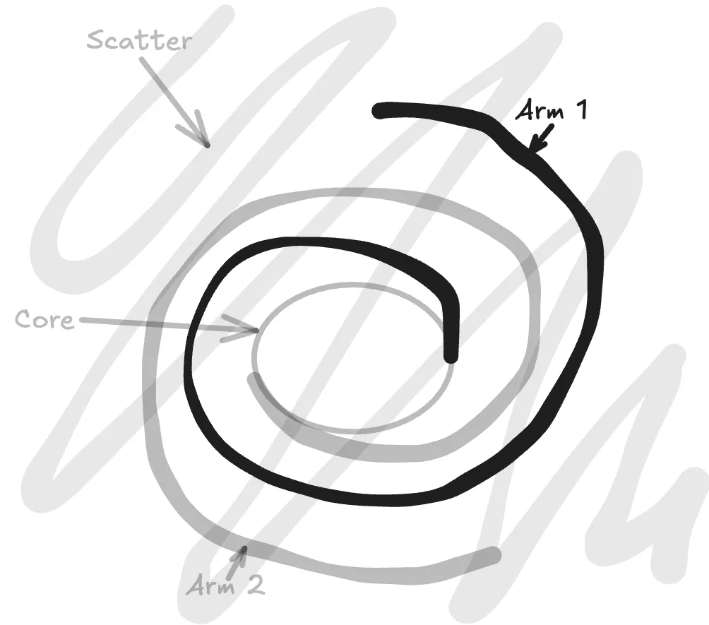
...and then straighten it out a bit:
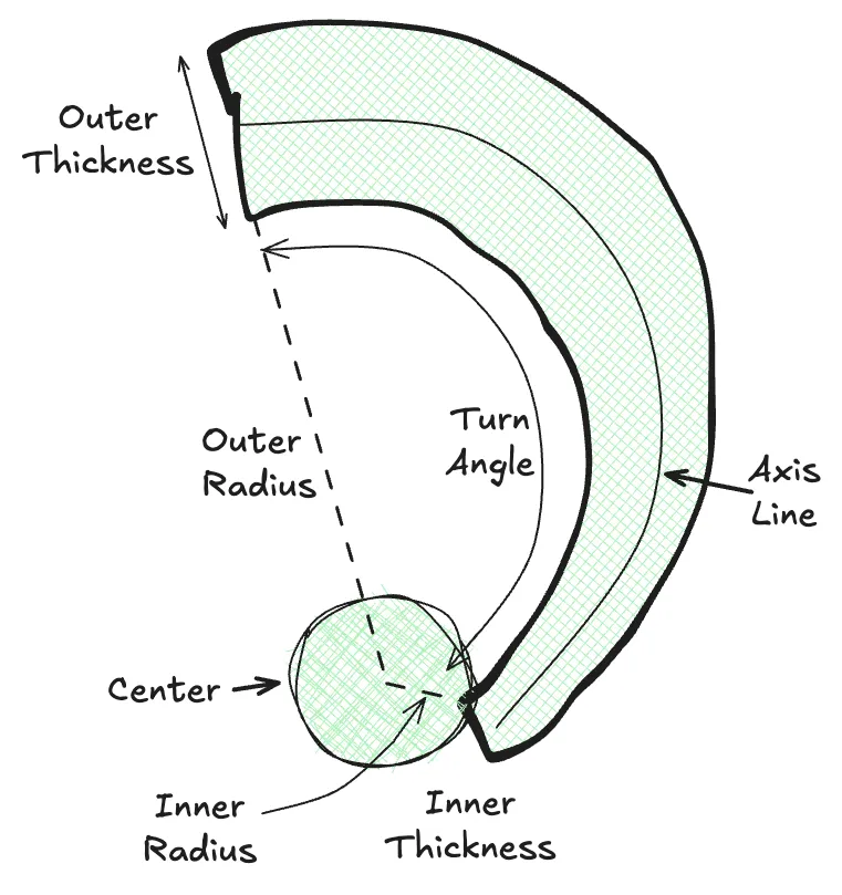
We can represent stars as 'some arbitrary distance along the axis line, at some arbitrary offset from the axis' and bound those so it'll always be in the bounds of the arm. From here, plotting a star is simply:
- Pick a random scale (x) from 0 to 1.
- Calculate the angle of the star as
θ = INIT_THETA + x * ARM_TURNS. - Calculate the radius at the point (we can combine radius + θ to get the axis position) as
r = CENTER_RADIUS + x * ARM_RADIUS. - Calculate the axis position by combining r/θ
(r.cos(θ), r.sin(0)). - Calculate the axis width at that point by
y = ARM_BASE_THICKNESS + x * (ARM_TIP_THICKNESS - ARM_BASE_THICKNESS). - Calculate a random offset distance from the axis from
-y/2toy/2.
With this, we now have a randomly-plotted star on a single arm, with a fairly even distribution throughout. All we have to do now is randomly assign each star an arm, and then calculate the other parameters.
case GalaxyPart.Arms: {
  const useOtherArm = sample(2, RNG);
  const radius = CENTER_RADIUS + ARM_RADIUS * RNG();
  const theta = ARM_INIT_THETA + ((radius - CENTER_RADIUS) / ARM_RADIUS) * ARM_TURNS + (useOtherArm ? Math.PI : 0);
  const armThickness = ARM_TIP_THICKNESS + ((radius - CENTER_RADIUS) / ARM_RADIUS) * (ARM_BASE_THICKNESS - ARM_TIP_THICKNESS);
  const lateralOffset = armThickness * RNG() - armThickness / 2;
  const lateralOffsetX = lateralOffset * Math.cos(theta);
  const lateralOffsetY = lateralOffset * Math.sin(theta);
  return {
	coords: { x: radius * Math.cos(theta) + lateralOffsetX, y: radius * Math.sin(theta) + lateralOffsetY },
	proximity: radius / GALAXY_SIZE,
	customRevolution: null,
  };
}
case GalaxyPart.Arms: {
const useOtherArm = sample(2, RNG);
const radius = CENTER_RADIUS + ARM_RADIUS * RNG();
const theta = ARM_INIT_THETA + ((radius - CENTER_RADIUS) / ARM_RADIUS) * ARM_TURNS + (useOtherArm ? Math.PI : 0);
const armThickness = ARM_TIP_THICKNESS + ((radius - CENTER_RADIUS) / ARM_RADIUS) * (ARM_BASE_THICKNESS - ARM_TIP_THICKNESS);
const lateralOffset = armThickness * RNG() - armThickness / 2;
const lateralOffsetX = lateralOffset * Math.cos(theta);
const lateralOffsetY = lateralOffset * Math.sin(theta);
return {
coords: { x: radius * Math.cos(theta) + lateralOffsetX, y: radius * Math.sin(theta) + lateralOffsetY },
proximity: radius / GALAXY_SIZE,
customRevolution: null,
};
}Crucially, each of the stars has to have the same angular velocity as the others - otherwise they'll end up out-of-sync, and the shape of the arms that we've worked on so far would collapse after a few seconds.
You might also notice the RNG() calls - these are calls to a seeded PRNG function on the frontend, so that every galaxy plots the same for the same data. Does it change anything? Not particularly, but it's still cute!
# The Scattered Stars
Now we fill in the rest of the blank canvas with some stars. For these, we generate a random position and velocity - and we can actually make some of them go against the flow of the other stars, just to introduce a teensy bit of chaos.
That being said, we can't just generate an X and Y directly - since our galaxy is rotating, having a square/rectangle revolve would look pretty weird on the diagonal rotations. Instead, we randomize R and θ, so we get points scattered across a circle.
Okay, that was the easy part. We now have a function that takes each star and gives it all the parameters we need to render it - the angular velocity, the coordinates, the brightness, the size, the color, the shape. Now we actually render this.
# Part 3. The Suffering
It's a well-known meme (with more than a little basis in reality) that backend developers despise CSS. I, however, have been working professionally as a frontend developer for the past few years and completed multiple in-depth courses on CSS, styling, and animations.
And so I hate CSS with even more passion than the average backend developer.
Unlike the other two sections, the animation of the stars was painful enough that I don't want to elaborate on what went wrong and how I gradually changed things. Instead, I'll start off with the final state and explain what went into each step.
First of all, why CSS? Why not a significantly more performant and intuitive setup, like an animated canvas?
The answer is: I thought it'd be cool to see how far I could take this in vanilla CSS. And oh boy, was I in for a ride.
.star {
	position: absolute;

	--fade-in-duration: 1000ms;

	--animation-star-fade-in: star-fade-in ease-in var(--fade-in-duration) var(--delay) both;
	--animation-star-pulse: star-pulse ease-in var(--duration) calc(var(--delay) + var(--fade-in-duration)) infinite alternate;
	--animation-star-drift-revolve: star-drift-revolve linear var(--revolution) infinite alternate;
	--animation-star-revolve: star-revolve linear var(--revolution) infinite;
	--animation-star-slow-revolve: star-revolve linear 1200s infinite;

	--rotate-offset: calc(2 * 360deg / var(--points) + var(--rotation));

	--revolve-scale-from: scale(var(--scale-x), var(--scale-y)) rotate(0deg) translate(var(--left), var(--top)) rotate(360deg)
		scale(calc(1 / var(--scale-x)), calc(1 / var(--scale-y)));
	--revolve-scale-to: scale(var(--scale-x), var(--scale-y)) rotate(360deg) translate(var(--left), var(--top)) rotate(0deg)
		scale(calc(1 / var(--scale-x)), calc(1 / var(--scale-y)));

	@media (prefers-reduced-motion: no-preference) {
		animation: var(--animation-star-fade-in), var(--animation-star-pulse), var(--animation-star-revolve);
		&.drift {
			animation: var(--animation-star-fade-in), var(--animation-star-pulse), var(--animation-star-drift-revolve);
		}
	}

	animation: var(--animation-star-fade-in), var(--animation-star-slow-revolve);

	&:focus-visible {
		outline: 2px solid var(--color-amber-50);
		outline-offset: 2px;
		border-radius: 100vmax;
		box-shadow: 0 0 20px var(--color-amber-50);
	}

	left: var(--center-x);
	top: var(--center-y);

	will-change: transform, opacity;
	transform-origin: center;
	backface-visibility: hidden;
}

@keyframes star-fade-in {
	from {
		opacity: 0;
	}
}

@keyframes star-pulse {
	to {
		opacity: var(--opacity);
	}
}

@keyframes star-revolve {
	from {
		transform: var(--revolve-scale-from) translateZ(0);
	}
	to {
		transform: var(--revolve-scale-to) translateZ(0);
	}
}

@keyframes star-drift-revolve {
	from {
		transform: var(--revolve-scale-from) translate3d(0, 0, 0);
	}
	to {
		transform: var(--revolve-scale-to) translate3d(5px, 5px, 0);
	}
}

.inner-star {
	&:hover,
	&:focus,
	.star:focus & {
		transform: scale(2) rotate(var(--rotate-offset)) translateZ(0);
		transition: transform 200ms ease-in-out;
	}

	transform: rotate(var(--rotation)) translateZ(0);
	will-change: transform;
	transition: transform 500ms ease-in-out;
	backface-visibility: hidden;
	transform-origin: center;
}.star {
position: absolute;
--fade-in-duration: 1000ms;
--animation-star-fade-in: star-fade-in ease-in var(--fade-in-duration) var(--delay) both;
--animation-star-pulse: star-pulse ease-in var(--duration) calc(var(--delay) + var(--fade-in-duration)) infinite alternate;
--animation-star-drift-revolve: star-drift-revolve linear var(--revolution) infinite alternate;
--animation-star-revolve: star-revolve linear var(--revolution) infinite;
--animation-star-slow-revolve: star-revolve linear 1200s infinite;
--rotate-offset: calc(2 * 360deg / var(--points) + var(--rotation));
--revolve-scale-from: scale(var(--scale-x), var(--scale-y)) rotate(0deg) translate(var(--left), var(--top)) rotate(360deg)
scale(calc(1 / var(--scale-x)), calc(1 / var(--scale-y)));
--revolve-scale-to: scale(var(--scale-x), var(--scale-y)) rotate(360deg) translate(var(--left), var(--top)) rotate(0deg)
scale(calc(1 / var(--scale-x)), calc(1 / var(--scale-y)));
@media (prefers-reduced-motion: no-preference) {
animation: var(--animation-star-fade-in), var(--animation-star-pulse), var(--animation-star-revolve);
&.drift {
animation: var(--animation-star-fade-in), var(--animation-star-pulse), var(--animation-star-drift-revolve);
}
}
animation: var(--animation-star-fade-in), var(--animation-star-slow-revolve);
&:focus-visible {
outline: 2px solid var(--color-amber-50);
outline-offset: 2px;
border-radius: 100vmax;
box-shadow: 0 0 20px var(--color-amber-50);
}
left: var(--center-x);
top: var(--center-y);
will-change: transform, opacity;
transform-origin: center;
backface-visibility: hidden;
}
@keyframes star-fade-in {
from {
opacity: 0;
}
}
@keyframes star-pulse {
to {
opacity: var(--opacity);
}
}
@keyframes star-revolve {
from {
transform: var(--revolve-scale-from) translateZ(0);
}
to {
transform: var(--revolve-scale-to) translateZ(0);
}
}
@keyframes star-drift-revolve {
from {
transform: var(--revolve-scale-from) translate3d(0, 0, 0);
}
to {
transform: var(--revolve-scale-to) translate3d(5px, 5px, 0);
}
}
.inner-star {
&:hover,
&:focus,
.star:focus & {
transform: scale(2) rotate(var(--rotate-offset)) translateZ(0);
transition: transform 200ms ease-in-out;
}
transform: rotate(var(--rotation)) translateZ(0);
will-change: transform;
transition: transform 500ms ease-in-out;
backface-visibility: hidden;
transform-origin: center;
}Broadly, we can divide our styling for the stars into four parts:
- Static styling (color, size, shape)
- Positioning styling (to position and rotate each star to the correct position)
- Event styling (animating how the stars enter the screen, or their hover animations)
- Animation styling (to make the stars revolve and twinkle)
# Static Styling
Static styling is the simplest - we have three different SVGs for the different stars (4/5/6-points) and we render these based on the star. We also set the size, color, and brightness of the star via inline styles, and some focus styles through the stylesheet.
.star {
	&:focus-visible {
		outline: 2px solid var(--color-amber-50);
		outline-offset: 2px;
		border-radius: 100vmax;
		box-shadow: 0 0 20px var(--color-amber-50);
	}
}.star {
&:focus-visible {
outline: 2px solid var(--color-amber-50);
outline-offset: 2px;
border-radius: 100vmax;
box-shadow: 0 0 20px var(--color-amber-50);
}
}# Positioning Styling
Nothing else to see here, either - we just position the stars via left/top. Technically we could also include rotation and stuff here, but those automatically get covered in event styles.
.star {
	position: absolute;
	left: var(--center-x);
	top: var(--center-y);

	transform-origin: center;
	backface-visibility: hidden;
}

.inner-star {
	transform: rotate(var(--rotation)) translateZ(0);
}.star {
position: absolute;
left: var(--center-x);
top: var(--center-y);
transform-origin: center;
backface-visibility: hidden;
}
.inner-star {
transform: rotate(var(--rotation)) translateZ(0);
}# Event Styling
Now we finally start doing things.
.star {
	--fade-in-duration: 1000ms;

	--animation-star-fade-in: star-fade-in ease-in var(--fade-in-duration) var(--delay) both;

	--rotate-offset: calc(2 * 360deg / var(--points) + var(--rotation));

	animation: var(--animation-star-fade-in);

	will-change: transform, opacity;
}

@keyframes star-fade-in {
	from {
		opacity: 0;
	}
}

.inner-star {
	&:hover,
	&:focus,
	.star:focus & {
		transform: scale(2) rotate(var(--rotate-offset)) translateZ(0);
		transition: transform 200ms ease-in-out;
	}

	will-change: transform;
	transition: transform 500ms ease-in-out;
	backface-visibility: hidden;
	transform-origin: center;
}.star {
--fade-in-duration: 1000ms;
--animation-star-fade-in: star-fade-in ease-in var(--fade-in-duration) var(--delay) both;
--rotate-offset: calc(2 * 360deg / var(--points) + var(--rotation));
animation: var(--animation-star-fade-in);
will-change: transform, opacity;
}
@keyframes star-fade-in {
from {
opacity: 0;
}
}
.inner-star {
&:hover,
&:focus,
.star:focus & {
transform: scale(2) rotate(var(--rotate-offset)) translateZ(0);
transition: transform 200ms ease-in-out;
}
will-change: transform;
transition: transform 500ms ease-in-out;
backface-visibility: hidden;
transform-origin: center;
}Structure-wise, we have two main elements - the 'outer' star is responsible for positioning, while the 'inner' star is responsible for focus management, rotation, and interactive styles.
The way I wanted the galaxy to start animating was to add the stars one-by-one. That way, there'd be a large amount of stars gradually winking into existence, eventually making a galaxy. While the CSS here is fairly explanatory, the distribution of the fade-in times is actually interesting. Each star runs the star-fade-in animation via --animation-star-fade-in: star-fade-in ease-in var(--fade-in-duration) var(--delay) both, so how we calculate --delay has a significant impact on how the galaxy shimmers in.
After playing around with a lot of values (including a two-hour call about integrating a distribution to create a target function), I ended up settling on having the stars animate based on type. Scattered stars would animate in randomly in some interval, while the stars in the arms and center would animate inwards from the edges. This resulted in a cool effect where the galaxy would twinkle in from the edges inwards, like so:
# Animation Styling
This was the most annoying bit. In order to simplify things, let's break down what animations we want:
- We want our stars to all 'revolve' around the central point. This should happen without distorting the size/shape of the star, and should scale according to the page dimensions (so we end up stretching out our rendered 'circle' to an ellipse). We also need to make sure that all the animations we've defined previously (hover, position) are respected and don't break the revolution.
- The direction of the stars should stay constant, so they shouldn't rotate as they revolve. If they rotated at the same speed as their revolution, the relative motion between adjacent stars would cancel out and the animation would look rigid.
- The stars also need to 'twinkle'. This twinkling should be decoupled from other logic (otherwise entire clusters of stars will twinkle out simultaneously), and should be spread out evenly so that there's a constant 'twinkle' effect on the whole galaxy.
.star {
	--animation-star-pulse: star-pulse ease-in var(--duration) calc(var(--delay) + var(--fade-in-duration)) infinite alternate;
	--animation-star-drift-revolve: star-drift-revolve linear var(--revolution) infinite alternate;
	--animation-star-revolve: star-revolve linear var(--revolution) infinite;
	--animation-star-slow-revolve: star-revolve linear 1200s infinite;

	--revolve-scale-from: scale(var(--scale-x), var(--scale-y)) rotate(0deg) translate(var(--left), var(--top)) rotate(360deg)
		scale(calc(1 / var(--scale-x)), calc(1 / var(--scale-y)));
	--revolve-scale-to: scale(var(--scale-x), var(--scale-y)) rotate(360deg) translate(var(--left), var(--top)) rotate(0deg)
		scale(calc(1 / var(--scale-x)), calc(1 / var(--scale-y)));

	@media (prefers-reduced-motion: no-preference) {
		animation: var(--animation-star-pulse), var(--animation-star-revolve);
		&.drift {
			animation: var(--animation-star-pulse), var(--animation-star-drift-revolve);
		}
	}
	animation: var(--animation-star-slow-revolve);

	will-change: transform, opacity;
}

@keyframes star-pulse {
	to {
		opacity: var(--opacity);
	}
}

@keyframes star-revolve {
	from {
		transform: var(--revolve-scale-from) translateZ(0);
	}
	to {
		transform: var(--revolve-scale-to) translateZ(0);
	}
}

@keyframes star-drift-revolve {
	from {
		transform: var(--revolve-scale-from) translate3d(0, 0, 0);
	}
	to {
		transform: var(--revolve-scale-to) translate3d(5px, 5px, 0);
	}
}.star {
--animation-star-pulse: star-pulse ease-in var(--duration) calc(var(--delay) + var(--fade-in-duration)) infinite alternate;
--animation-star-drift-revolve: star-drift-revolve linear var(--revolution) infinite alternate;
--animation-star-revolve: star-revolve linear var(--revolution) infinite;
--animation-star-slow-revolve: star-revolve linear 1200s infinite;
--revolve-scale-from: scale(var(--scale-x), var(--scale-y)) rotate(0deg) translate(var(--left), var(--top)) rotate(360deg)
scale(calc(1 / var(--scale-x)), calc(1 / var(--scale-y)));
--revolve-scale-to: scale(var(--scale-x), var(--scale-y)) rotate(360deg) translate(var(--left), var(--top)) rotate(0deg)
scale(calc(1 / var(--scale-x)), calc(1 / var(--scale-y)));
@media (prefers-reduced-motion: no-preference) {
animation: var(--animation-star-pulse), var(--animation-star-revolve);
&.drift {
animation: var(--animation-star-pulse), var(--animation-star-drift-revolve);
}
}
animation: var(--animation-star-slow-revolve);
will-change: transform, opacity;
}
@keyframes star-pulse {
to {
opacity: var(--opacity);
}
}
@keyframes star-revolve {
from {
transform: var(--revolve-scale-from) translateZ(0);
}
to {
transform: var(--revolve-scale-to) translateZ(0);
}
}
@keyframes star-drift-revolve {
from {
transform: var(--revolve-scale-from) translate3d(0, 0, 0);
}
to {
transform: var(--revolve-scale-to) translate3d(5px, 5px, 0);
}
}We broadly have three animations - star-pulse (to make each star twinkle), star-revolve (to make each star revolve around the center), and star-drift-revolve (to make a 'drifting' star, which oscillates around each revolution alternately).
.star {
	@media (prefers-reduced-motion: no-preference) {
		animation: var(--animation-star-pulse), var(--animation-star-revolve);
		&.drift {
			animation: var(--animation-star-pulse), var(--animation-star-drift-revolve);
		}
	}
	animation: var(--animation-star-slow-revolve);
}.star {
@media (prefers-reduced-motion: no-preference) {
animation: var(--animation-star-pulse), var(--animation-star-revolve);
&.drift {
animation: var(--animation-star-pulse), var(--animation-star-drift-revolve);
}
}
animation: var(--animation-star-slow-revolve);
}We apply our animations via CSS variables - we'll get to the chaotic definitions of these variables in a second - by adding the star-pulse and star-revolve animations for most stars, and replacing star-revolve with star-drift-revolve for drifting stars. We also make sure that we replace all three animations with only star-slow-revolve (which is a slower version of star-revolve) for clients that prefer reduced motion.
@keyframes star-pulse {
	to {
		opacity: var(--opacity);
	}
}

@keyframes star-revolve {
	from {
		transform: var(--revolve-scale-from) translateZ(0);
	}
	to {
		transform: var(--revolve-scale-to) translateZ(0);
	}
}

@keyframes star-drift-revolve {
	from {
		transform: var(--revolve-scale-from) translate3d(0, 0, 0);
	}
	to {
		transform: var(--revolve-scale-to) translate3d(5px, 5px, 0);
	}
}
@keyframes star-pulse {
to {
opacity: var(--opacity);
}
}
@keyframes star-revolve {
from {
transform: var(--revolve-scale-from) translateZ(0);
}
to {
transform: var(--revolve-scale-to) translateZ(0);
}
}
@keyframes star-drift-revolve {
from {
transform: var(--revolve-scale-from) translate3d(0, 0, 0);
}
to {
transform: var(--revolve-scale-to) translate3d(5px, 5px, 0);
}
}The keyframes themselves are fairly straightforward - we drive them via CSS variables (keeping the complex logic in CSS variables and consuming them directly for animations is a pattern that I'm fond of, since it makes reading and understanding the animations much simpler). star-pulse is animated by star-pulse ease-in var(--duration) calc(var(--delay) + var(--fade-in-duration)) infinite alternate and constantly alternates between 'bright' and 'dim' every 1-5s, with the ease-in animation ensuring that the stars stay bright normally and only occasionally spike to being dim. star-revolve and star-drift-revolve behave similarly - they simply animate between the beginning and ending transforms (which we calculate in --revolve-scale-from and --revolve-scale-to). The difference between them is that star-drift-revolve has a slight offset between the from and to frames, and runs alternately (so the stars will oscillate over a full revolution), while the star-revolve replays itself with no offset (we ensure that the starting and ending frames overlap).
.star {
	--animation-star-drift-revolve: star-drift-revolve linear var(--revolution) infinite alternate;
	--animation-star-revolve: star-revolve linear var(--revolution) infinite;
}.star {
--animation-star-drift-revolve: star-drift-revolve linear var(--revolution) infinite alternate;
--animation-star-revolve: star-revolve linear var(--revolution) infinite;
}prefers-reduced-motion clients will use a fixed 1200s timing, so there's no dissonance between the revolution of the stars.
Now, to the meat of the matter:
.star {
	--revolve-scale-from:
		/* inverse scale */
		scale(var(--scale-x), var(--scale-y))
		/* inverse rotate */
		rotate(0deg)
		/* move */
		translate(var(--left), var(--top))
		/* rotate */
		rotate(360deg)
		/* scale */
		scale(
			calc(1 / var(--scale-x)),
			calc(1 / var(--scale-y))
		);
	--revolve-scale-to:
		/* inverse scale */
		scale(var(--scale-x), var(--scale-y))
		/* inverse rotate */
		rotate(360deg)
		/* move */
		translate(var(--left), var(--top))
		/* rotate */
		rotate(0deg)
		/* scale */
		scale(
			calc(1 / var(--scale-x)),
			calc(1 / var(--scale-y))
		);
}.star {
--revolve-scale-from:
/* inverse scale */
scale(var(--scale-x), var(--scale-y))
/* inverse rotate */
rotate(0deg)
/* move */
translate(var(--left), var(--top))
/* rotate */
rotate(360deg)
/* scale */
scale(
calc(1 / var(--scale-x)),
calc(1 / var(--scale-y))
);
--revolve-scale-to:
/* inverse scale */
scale(var(--scale-x), var(--scale-y))
/* inverse rotate */
rotate(360deg)
/* move */
translate(var(--left), var(--top))
/* rotate */
rotate(0deg)
/* scale */
scale(
calc(1 / var(--scale-x)),
calc(1 / var(--scale-y))
);
}Let's first look at what the heck is going on here, and why we have five transforms to just move a single object.
First of all, we want to animate our star rotating around the center. In order to do this, we need to know the coordinates of the reference point (which is (0,0) in our frame of reference being centered at the middle of the page), the offset of the star (which we sort of have via --left and --top), and the angle of revolution (which is what we're animating).
Do note here that our current --left and --top have no idea about the page so far. After all, our plotter was simply plotting the stars on a square, so we now need to stretch things out accordingly without stretching out the shape of the star itself. We also can't simply rotate the star around the center, since that would trace out a full circle. And our page will almost always be a rectangle (either in landscape or portrait mode), so we need is an elliptical rotation. To get around this, we take advantage of a couple things:
- Scaling and then downscaling an element by the same factor via
transformwill result in no visible difference, and in a majority of cases will be heavily optimized by the rendering engine. - The same applies for rotation - rotating an element by
θand then rotating it backwards byθ(or ahead by360º-θ) will result in no visible change and be optimized away. - Defining an animation with the only difference in
from/tovalues being in rotation ensures that the frames of the animation will animate linearly with respect to rotation. - Scaling an element while it's centered at the origin won't affect its placement, and neither will rotation.
If we tried to animate this via a matrix, the intermediate matrix values would result in no movement - since the from and to keyframes resolve to the same value! Even if they were different, directly creating a transformation matrix would result in a smooth, linear motion directly between the target frames. Since we instead specify a series of transforms, this makes it easier for both us to understand how the transformation is done, and for the browser to understand how to animate between the states.
Now that we have what we need, let's look at the transformations.
- Our target goal is to position the star at (
--left,--top), then rotate it by the current animation angle, and then scale it by the page size.- We can't change this order - rotating first would spin the star in-place as a rotation instead of a revolution, and scaling before the movement would mean the scale is effectively redundant, since we start at
(0,0). - Similarly, if after positioning we try to scale before rotating, we'll end up with a star that traces a full circle off its original distance instead of an ellipse.
- We can't change this order - rotating first would spin the star in-place as a rotation instead of a revolution, and scaling before the movement would mean the scale is effectively redundant, since we start at
- We also need to counteract these and make sure the final star is unscaled and unrotated. Taking advantage of the fact that
scale()androtate()will not affecttranslate()when positioned at the transform-origin, we can safely apply them before thetranslate()to counteract the required transforms that will be applied afterward. - We therefore have
--frame: scale(inverse) rotate(inverse) translate() rotate() scale(). Inserting our values, we get--frame: scale(inverse) rotate(360º-θ) translate(--left, --top) rotate(θ) scale(1/--scale-x, 1/--scale-y).
.star {
	--revolve-scale-from:
		/* inverse scale */
		scale(var(--scale-x), var(--scale-y))
		/* inverse rotate */
		rotate(0deg)
		/* move */
		translate(var(--left), var(--top))
		/* rotate */
		rotate(360deg)
		/* scale */
		scale(
			calc(1 / var(--scale-x)),
			calc(1 / var(--scale-y))
		);
	--revolve-scale-to:
		/* inverse scale */
		scale(var(--scale-x), var(--scale-y))
		/* inverse rotate */
		rotate(360deg)
		/* move */
		translate(var(--left), var(--top))
		/* rotate */
		rotate(0deg)
		/* scale */
		scale(
			calc(1 / var(--scale-x)),
			calc(1 / var(--scale-y))
		);
}.star {
--revolve-scale-from:
/* inverse scale */
scale(var(--scale-x), var(--scale-y))
/* inverse rotate */
rotate(0deg)
/* move */
translate(var(--left), var(--top))
/* rotate */
rotate(360deg)
/* scale */
scale(
calc(1 / var(--scale-x)),
calc(1 / var(--scale-y))
);
--revolve-scale-to:
/* inverse scale */
scale(var(--scale-x), var(--scale-y))
/* inverse rotate */
rotate(360deg)
/* move */
translate(var(--left), var(--top))
/* rotate */
rotate(0deg)
/* scale */
scale(
calc(1 / var(--scale-x)),
calc(1 / var(--scale-y))
);
}A better way to define this animation would be through the @property rule.
@property --animation-angle {
	syntax: '<degree>';
	inherits: true;
	initial-value: 0deg;
}

.star {
	--animation-star-revolve: star-revolve linear var(--revolution) infinite;

	transform:
		/* inverse scale */
		scale(var(--scale-x), var(--scale-y))
		/* inverse rotate */
		rotate(var(--animation-angle))
		/* move */
		translate(var(--left), var(--top))
		/* rotate */
		rotate(calc(360deg - var(--animation-angle)))
		/* scale */
		scale(
			calc(1 / var(--scale-x)),
			calc(1 / var(--scale-y))
		);

	animation: var(--animation-star-revolve);
}

@keyframes star-revolve {
	from {
		--animation-angle: 0deg;
	}
	to {
		--animation-angle: 360deg;
	}
}
@property --animation-angle {
syntax: '<degree>';
inherits: true;
initial-value: 0deg;
}
.star {
--animation-star-revolve: star-revolve linear var(--revolution) infinite;
transform:
/* inverse scale */
scale(var(--scale-x), var(--scale-y))
/* inverse rotate */
rotate(var(--animation-angle))
/* move */
translate(var(--left), var(--top))
/* rotate */
rotate(calc(360deg - var(--animation-angle)))
/* scale */
scale(
calc(1 / var(--scale-x)),
calc(1 / var(--scale-y))
);
animation: var(--animation-star-revolve);
}
@keyframes star-revolve {
from {
--animation-angle: 0deg;
}
to {
--animation-angle: 360deg;
}
}But hindsight is always 20/20.
# Performance
I've skipped over a lot of the iterations I went through while trying to optimize this. For context, this is rendering 3 thousand DOM nodes with CSS transforms, all of them moving, twinkling, and animating independently. They're also interactive - you can tab through them, hover and focus, view metadata for each star - which is lovely to see, but just a teensy bit expensive on resources. After all, if every star is constantly moving and changing on opacity, we can't reuse computed values from previous frames!
With that being said, it's actually surprisingly performant on even mid-tier hardware. Heck, my phone can render my GitHub Galaxy without stuttering. A lot of this can be attributed to the amount of terms that cancel out in the transformation, which means the browser can reuse some values while painting each frame.
Heck, maybe I can even render massive galaxies like Linus Torva-
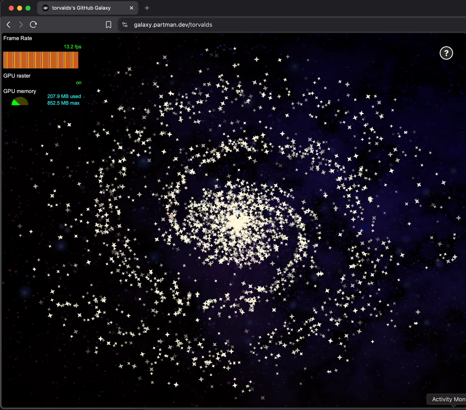
Okay, maybe not.
If we instead tried to do this in a canvas, it'd probably be wayyyy faster, since the browser would no longer need to carry around the overhead of thousands of DOM nodes. It would then be able to divert all resources towards painting, which is a much faster operation.
But then it wouldn't be as fun!